This article is not meant to be a “do it this way” style post, more an “Oh! I didn’t fully understand that” … and probably still don’t!! Don’t stop reading though, as there might just be something (like me) you hadn’t grasped, or hadn’t stopped to think too much about it before.
The starting point is that you’re shooting in RAW, if you’re not then a lot of what follows will be academic because you will just have to accept and set in camera the colour profile one of the ones your camera manufacturer provides. [Ref. How to Use Your Camera’s Color Profiles in Lightroom]
... manufacturers started adding color profiles to their cameras. I’m using the term color profile deliberately because every manufacturer has a different name for it. They are listed below:

Canon: Picture Style
Nikon: Picture Control
Fujifilm: Film Simulation Mode
Sony: Creative Style
Pentax: Custom Image
Olympus: Picture Mode

Fujifilm’s approach is interesting because they have named their profiles after genuine film types. As a result, Fuji color profiles are more nuanced and subtle than those made by the other manufacturers. This new approach to color profiles is one of the features that sets Fujifilm cameras apart from the competition.
I will be using the Sony A7rIII as the camera that I refer to when discussing colour profile, but it shouldn’t be too difficult to see how this applies to other cameras, so I will be using the term Creative Style to refer to the in-camera profile you can set.
So you have the option of choosing a Creative Style, but perhaps you should pause and consider whether that’s the best approach. You’re almost certainly going to be post-processing in Lightroom, so perhaps it might be a good idea to start from a base that never changes. So from the choices in the Sony camera – Standard (default), Vivid, Neutral, Portrait, Landscape, Black & White. The default is Standard, but I’ve chosen to use Neutral as I don’t want any in-camera adjustment.
The same logic applies to White Balance. In the Sony you have the choice of Auto WB (default), Daylight, Shade, Cloudy, Incandescent, Flourescent, Flash, and a few more specialist ones. It would seem “obvious” to leave the camera on the default setting as you could be assured that the “best guess algorithm” it adopts would be the best base to start from. But better perhaps to choose a “known” setting such as Daylight (5050K) and to change that in post-processing. [NB not all Daylight White Balances are the same. In Lightroom, Daylight is 5500K – just to confuse everyone.]
Then we turn to Lightroom. At Import you are able to apply Develop presets, and this is your opportunity to change both of the above in-camera settings, or to adopt the camera settings to work from, as the base of your post-processing. This is what I do and I have set the Develop settings on Import to be the Camera settings, ie Neutral and Daylight.
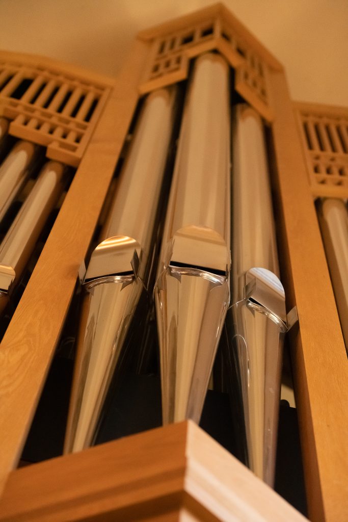
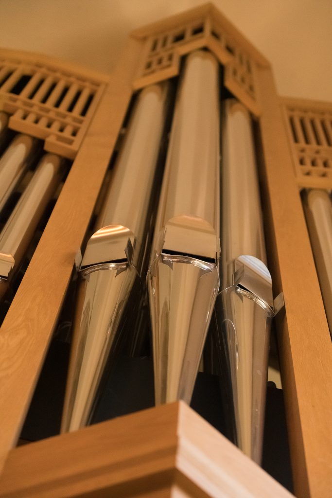
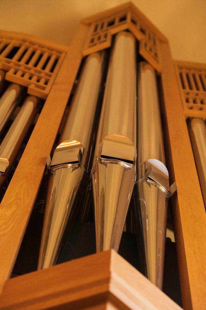
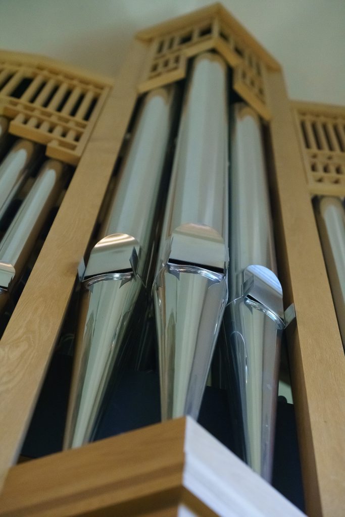
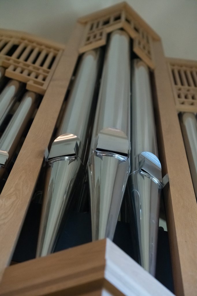
By now you’ve probably begun to think, “does this really matter?”, so we better get down to some specifics. I’m going to use some images taken in Llandaff Cathedral to demonstrate the variety of results you can get. Just to re-iterate, if you’re shooting in RAW you can change these; if JPEG you can’t – they’re baked into the image.
First of all, shots taken with the White Balance set to Daylight (5050K) – my preferred setting as an everyday base.

The differences are subtle, I grant you, but there are differences in the colour casts and if you’re taking shots in different locations, and in different styles, it might be best to have one that you know, you really really know, to have as your base. As I’ve written above I’ve chosen to use Camera Neutral, but I could quite easily have also chosen Adobe Neutral as I’m using the Adobe RGB colour space in my camera, rather than sRGB – the other alternative.
Now let’s look at the same shots when a Lightroom Tungsten White Balance setting of 2850K is applied after Import.


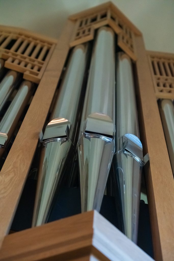
Again the differences within the Tungsten White Balance with the chosen Colour Profile are subtle. What these shots show is how much White Balance (not unexpectedly) will change the image, but I’m satisfied that either of the two Neutral Colour Profiles provide me with a suitable base image to work from, and I can then successfully chose the most appropriate White Balance using the eye dropper in Lightroom to the image to get the best result to then start post-processing work on.
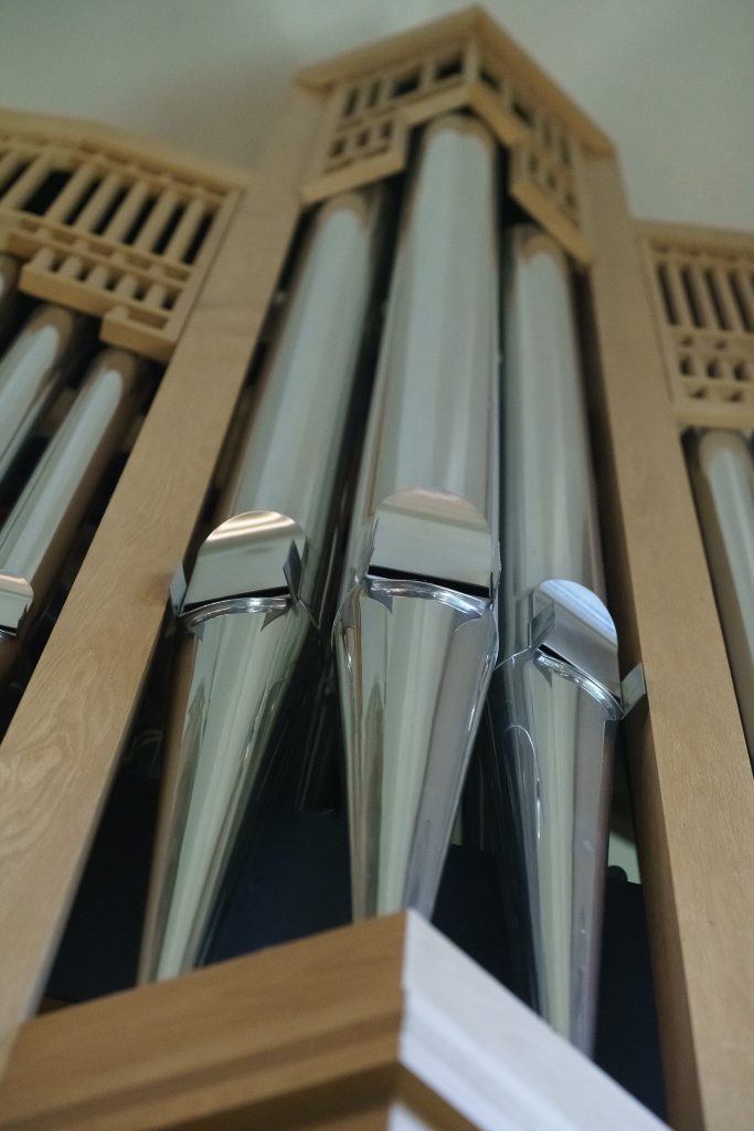
The featured image at the head of this post was created using a Sony Camera Neutral Creative Style, and using Daylight White Balance on capture, subsequently changed to Custom 3950K, and then Auto Basic Settings applied in the Develop module.